
It is important for the University to present a consistent color palette across all media for the sake of unity and brand recognition.
Our color palette consists of primary, secondary, tertiary, and neutral colors for use throughout all digital and print communications.
The Pantone Matching System (PMS) has been used to establish the color palette for print media. CMYK, RGB, and HEX builds are also listed to support other media and platforms.
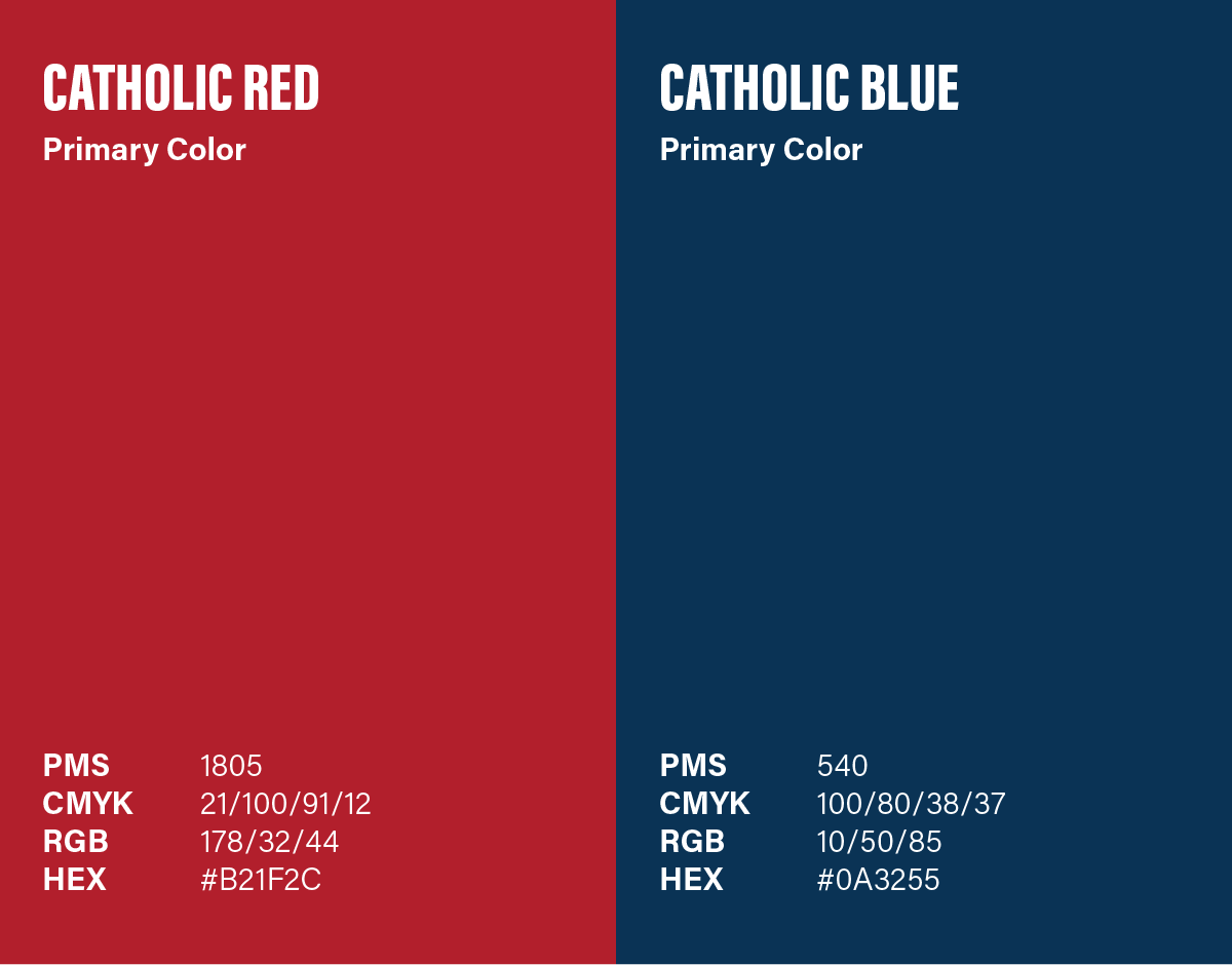
The colors have been carefully selected to reflect the bold, confident, and distinctive nature of the University, which has a legacy of honoring the past while living in the present and embracing the future.
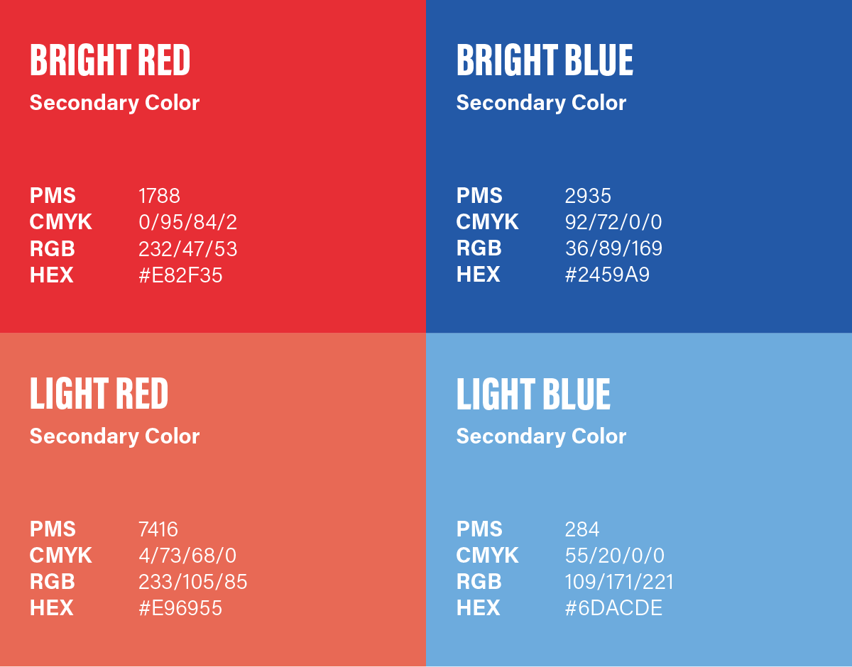
Colors in the secondary palette add variety and vibrancy, but should be used mainly to complement the colors from the primary palette. In most cases, colors from the primary palette should visually represent a larger percentage of color usage on your project.
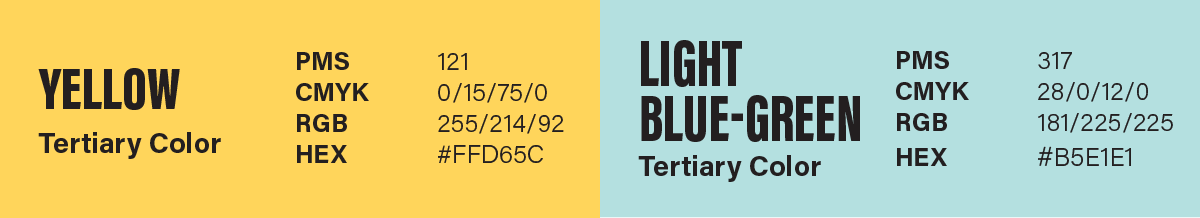
The tertiary colors should be used minimally — as accent colors only. The usage of these colors should be a maximum of 5–10% of your total visual representation.

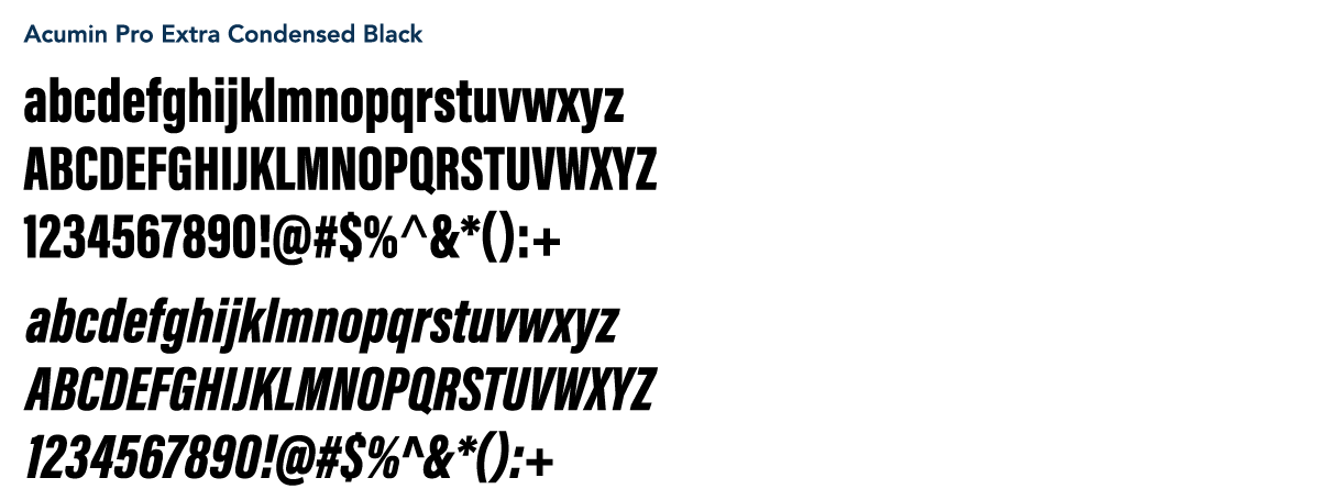
Typography is a powerful part of our brand that enhances our visual messaging in each communication.
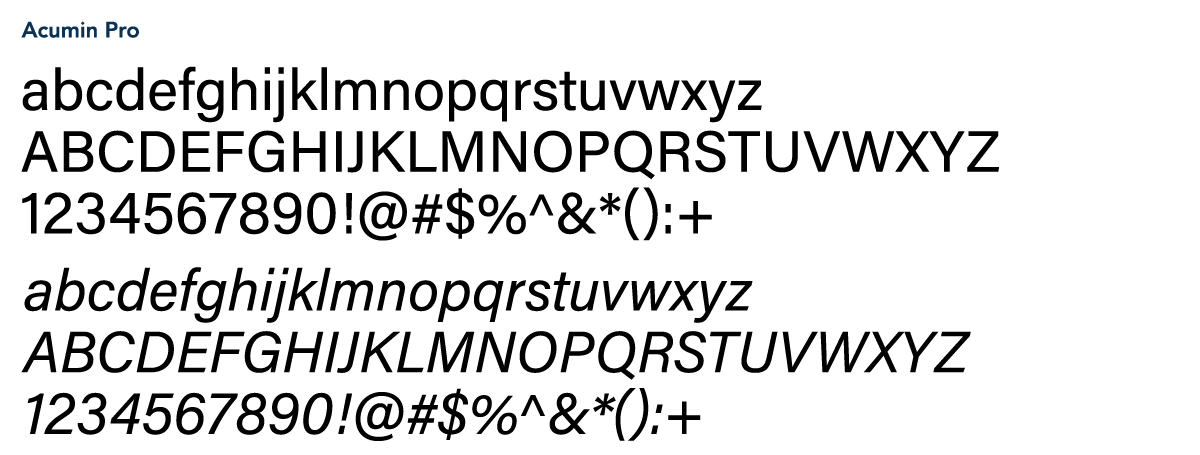
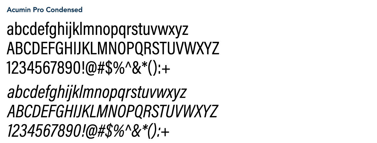
Acumin Pro
A versatile sans serif font family that provides a rich typographic approach:
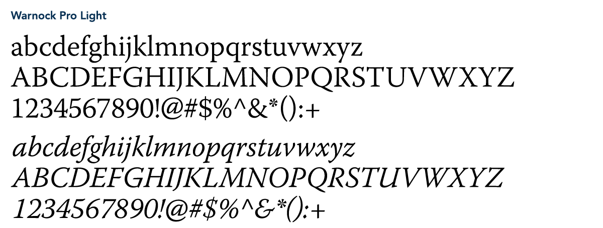
Warnock Pro
A classic yet contemporary type family that performs a variety of typographic tasks with elegance. The wide range of weights available in the Warnock Pro family lends versatility and adaptability to messaging needs.
Note: These fonts are available through the Adobe Creative Cloud. Also, if the body copy in your project is small, Warnock Pro Regular may need to be used.
Never use fonts that mimic or resemble the Catholic University font families, because their use will detract from the brand and compromise its effectiveness.

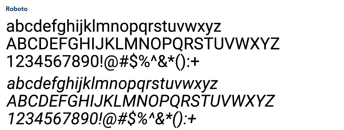
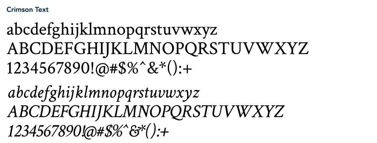
When the University’s primary fonts are not accessible, these specified alternatives from the Google font library can be used and downloaded from fonts.google.com.
Return to Identity Standards – Section One >>
Introduction | Protecting Our Brand | Logo | Shield
Continue Reading Identity Standards – Section Three >>
Presidential Seal | Athletics | Stationery | Email | Social Media